Web Applications
Lab 03
special thanks to Jan Michelfeit & Martin Kruliš
Agenda
- Motivation
position:float:
Motivation
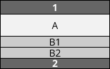
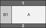
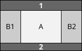
Here are a few Wordpress themesCommon Web Layouts


Tools at Hand
-
display: inline-blockdisplay: flexboxdisplay: grid
- positioning
- floats columns
Display Modes
| Value | Example |
|---|---|
inline |
<span> |
inline-block
|
<input> |
block |
<div> |
none |
not laid out at all |
table-cell |
<td> |
| … |
Display Modes
-
<span>does not respect width, height, and vertical padding/margin,<img>and<div>do -
<span>or<img>flow as lines,<div>starts a new "line"
(more precisely, inline content is laid out horizontally in line boxes) <span>can be broken across lines- nesting - inline must not contain block
display: inline-block
-
How to position a box to the right edge of container with
inline-block? - Codepen example
- inline-block at learnlayout.com
Exercise 1
Using Display
Download this HTML document and fix TODOs in the source code.
Positioning
Usage
-
positionproperty with valuesrelative,absolute,fixed, andstatic -
Properties
left,right,top,bottom, andz-index - Powerful - complex layouts, animation effects, ...
- More about positioning at MDN, Learn CSS Layout, CSS Tricks
Positioning - Relative
Example:
left:20px; top:20px
Positioned element moved relative to the original position according to left/right/top/bottom
Rest of the layout as if not positioned.
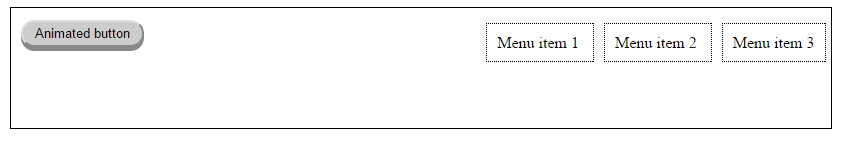
Positioning - Absolute
Example:
left:20px; top:20px
Positioned element moved relative to the closest positioned ancestor. Rest of layout as if the positioned element is not present. This implies that parent block does not increase size to encompass the element and the element may overflow.
Positioning - Fixed
Element moved relative to the viewport and it doesn't move when scrolling. Rest of layout as if the positioned element is not present.
Positioning - left/top/right/bottom
-
Distance from the edge of containing block for
absoluteandfixed - Offset from normal position for
relative - Can be absolute or percentage of containing block's size
left:25%
width:50%
bottom:0
Exercise 2
Using Positioning
Download this HTML document and fix TODOs in the source code.
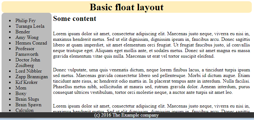
The result should look like this.
Exercise 3
Positioning-based Layout
Download this HTML document and fix TODOs in the source code(or use this codepen ).
The result should look like this.
Floating
-
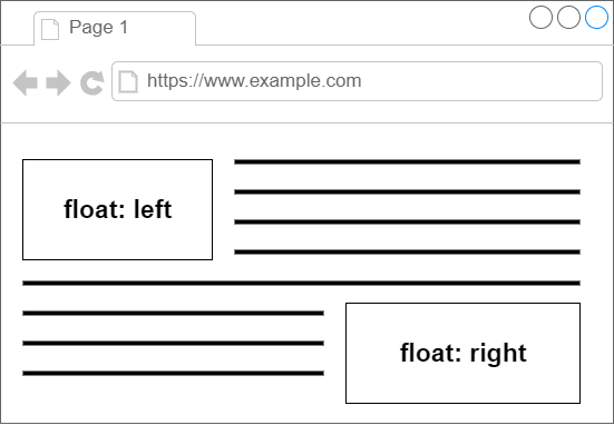
floatproperty with valuesleft,right,none - Originally for images inside text
- MDN on floats
Floated Elements
Floated Elements - Rules
-
Displayed as inline-block
implies one should explicitly set width (unless implicit) - Shifted to the left/right of the current line until its edge touches the containing block edge or edge of another float
- Positioned vertically as it would be within the normal flow, aligned with the top of the current line box
- If there is not enough horizontal room for the float, it is shifted downward until either it fits or there are no more floats present.
-
Other boxes laid out as if the float didn't exist, except for the current and subsequent line boxes shortened as necessary to make room for it.
Implies that parent block does not increase size to encompass the float and the float may overflow
Floated Elements - clear
- Specifies which sides of an element's box(es) may not be adjacent to an earlier floating box.
-
clearproperty can have valuesleft,right,both,none - Can be applied both to non-floated block elements and floated elements
float:right
clear:none
float:right
clear:none
float:right
clear:none
float:right
clear:right
Common Pitfalls
Common Pitfalls
- Not all browsers render the same, not all support all features (CSS properties, tags, floats, ...)
-
caniuse.com - browser support overview
e.g. column-count: example -
unstable CSS properties have
vendor prefixes
(
-moz-,-webkit-,-ms-, …) - Test in all browser you need to support
- Order of elements matters (unless using absolute/fixed positioning, flexbox, or grid)
Common Pitfalls - Positioning
- Absolutely positioned elements typically should be inside another positioned element (otherwise you position relative to the entire page)
- Beware of overflows
Common Pitfalls - Floats
- Can be fragile with regard to window size if widths are not exactly as expected - example (try to resize the window)
- Depends on order of HTML elements
- Specify widths
- More about floats
Exercise 4
Float-based layout
Download
this HTML document
and fix TODOs in the source code
or use this codepen.
The result should look like this.
Hint: margin
property is often useful when creating a layout