Web Applications
Lab 04
Agenda
- Motivation
- Container
- Columns
- Menu
- Layout
- Dark Mode
Motivation
Objective
- Media
- Flex
- Grid
Container : Media
Breakpoints
-
xs < 576px
max-width: 540px -
md ≥ 768px
max-width : 720px -
lg ≥ 992px
max-width : 960px -
xl ≥ 1200px
max-width : 1140px
Exercise 1
Download this HTML document and fix TODOs in the source code.
Responsive Web Design
- w3schools
- Quote: Browsers on those devices scaled down the entire web page to fit the screen.
- Quote: If the user is forced to scroll horizontally, or zoom out, to see the whole web page it results in a poor user experience.
-
<meta name="viewport" content="width=device-width, initial-scale=1">
Columns : Media & Flex
Responsive Design


Grid system
- Split screen into 12 columns.
- User can define how many columns are occupied by an element.
- Grids can be nested to create complex layouts.
- Element to column(s) mapping can be defined for given screen width(s).
-
Grid system with Flex.
A Complete Guide to Flexbox
Exercise 2
Download this HTML document and fix TODOs in the source code.
In order to test try resizing the window. The results should look like this on screen:
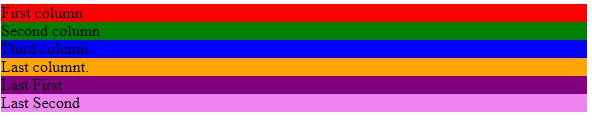
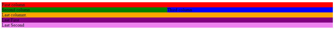
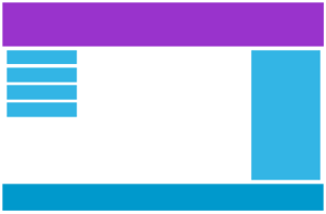
Grid & Columns
- Add the container class from Exercise 1 to the div .row element.
- Resize the window.
Grid vs. Columns
Menu
Extra
- No JavaScript
- Mouse cursor
- Icons
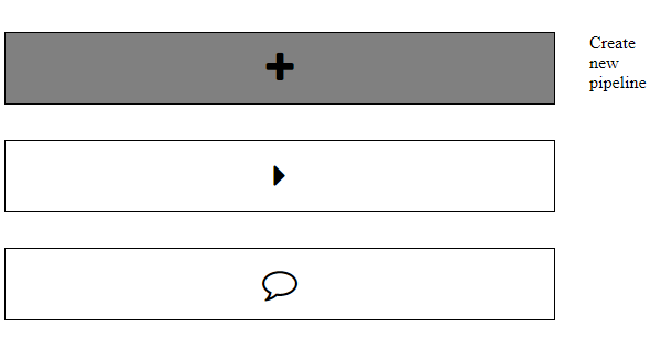
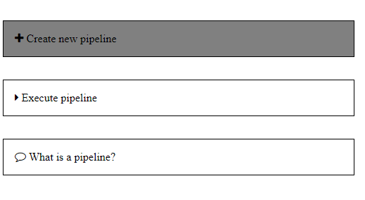
Exercise 3
Download this HTML document and fix TODOs in the source code.
The results should look like this on screen:
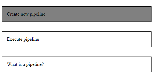
The first item is selected i.e. has active :hover pseudo-class.
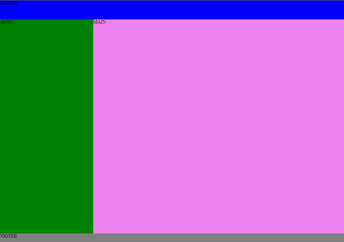
Page Layout : Grid
Grid
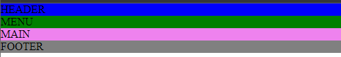
Exercise 4
Download this HTML document and fix TODOs in the source code.
The results should look like this on screen:
Light / Dark Mode
Why?
Exercise 5
Download this HTML document and fix TODOs in the source code.