Create a new HTML file named form.html with HTML form.
The form must contain:
The form must be submitted to: https://webik.ms.mff.cuni.cz/nswi142/services/02-handle-form.php using GET method.
Check Network tab to see how are data send.
Add validation using HTML5 Forms and make sure your page is valid. You can upload the HTML directly using "text input" as a value for "Check by".
Question: What is happening and where?
Question:
Is the client side validation enough?
Can you send age equal to 300?
Change the method to POST, open Network tab and examine the request.
What happens when you refresh the page?
Cascading Style Sheets (CSS) is a stylesheet language used to describe the presentation of a document written in HTML. Example of complete design change is CSS Zen Garden.
Did you know, that this presentation is a single webpage?
There are different CSS levels and modules. Levels and modules determine which properties are available. You should be aware of what subset of CSS you can use.
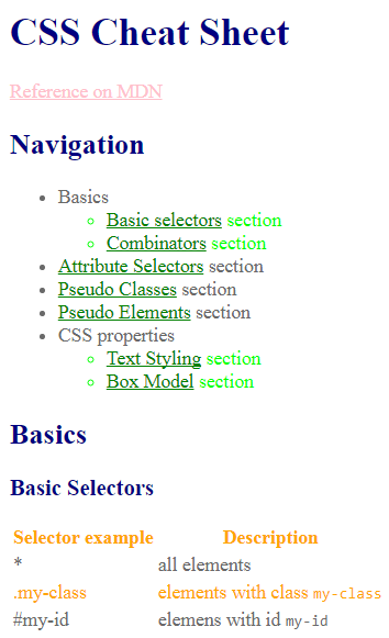
You can utilize a W3C CSS validator to check your CSS.
ReCodEx is limited to CSS Level 3!
What is the CSS selector specificity of the following selectors and why does it matter?
li.sidebar a.externaldiv#navigation a[href^="http"]:hoverSpecificity Calculator seems to work.
Shorthand properties are CSS properties that let you set the values of multiple other CSS properties simultaneously.
.border {
  border-width: 1px;
  border-style: solid;
  border-color: black;
}
/* vs */
.border {
  border: 1px solid black;
}
.one   { border-width: 1px; }
.two   { border-width: 1px 2px; }
.three { border-width: 1px 2px; }
.four  { border-width: 1px 2px 3px 4px; }
Download this HTML document and fix TODOs in the source code. The expected result should look like this.
The display CSS property sets whether an element is treated as a block or inline box and the layout used for its children, such as flow layout, grid or flex.
Use display: none; to remove element from page without leaving space for it.
Sometime there are alternatives you need to choose from. For example inline-block vs flex (wait for next practical).
Inline elements are affected by text-align property.
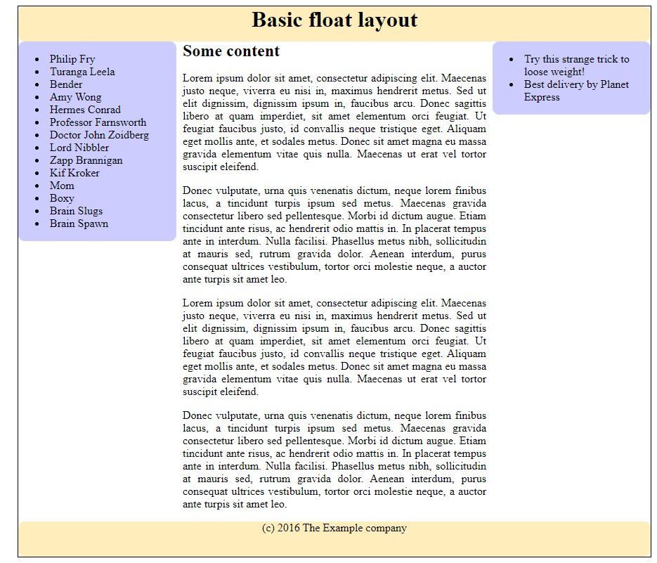
The float CSS property places an element on the left or right side of its container, allowing text and inline elements to wrap around it. The element is removed from the normal flow of the page, though still remaining a part of the flow.
Rules:
clear
Clear values: left, right, both, none.
Download this HTML document and fix TODOs in the source code.
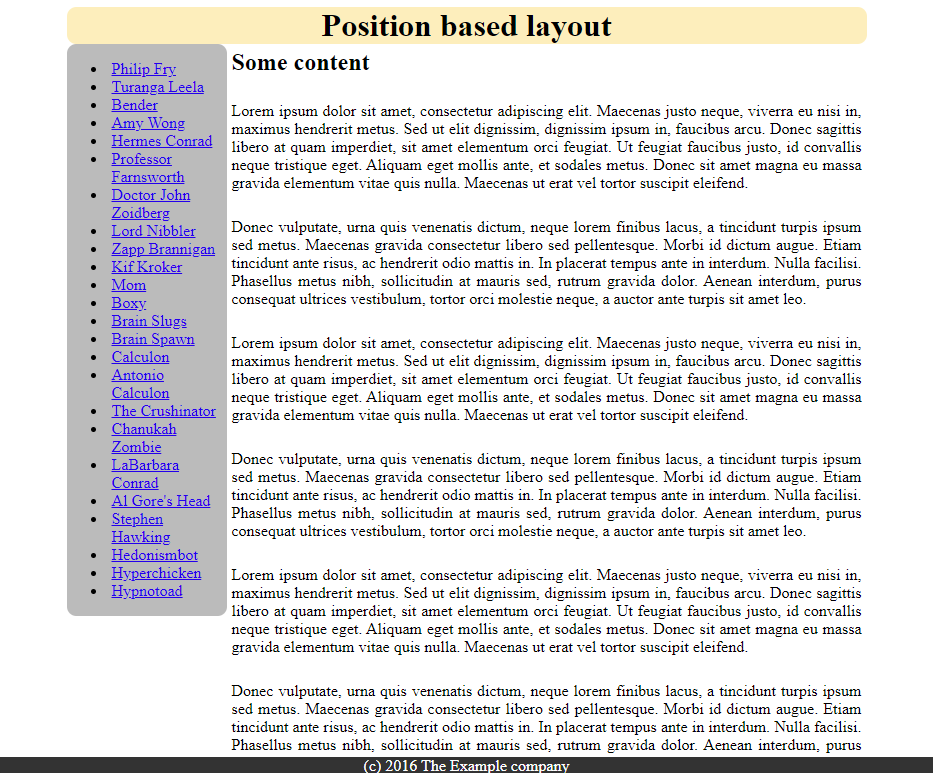
Combination of position,
left, left, right, top, bottom, and z-index.
By appropriate combination of display modes and positioning we can create layouts.
Selected values for CSS position property.
Relative - positioned element moved relative to the original position according to left/right/top/bottom. Rest of the layout as if not affected. Move is after positions are determined. We can move by 0 to make element positioned.
Absolute - positioned element moved relative to the closest positioned ancestor. Rest of layout as if the positioned element is not present. This implies that parent block does not increase size to encompass the element and the element may overflow.
Fixed - Element moved relative to the viewport and it doesn't move when scrolling. Rest of layout as if the positioned element is not present.
Additional resources related to CSS.
Let's try the old way of creating layouts. You are NOT allowed to use flex or grid. In addition, do not change display mode, or use positioning for float layout and vice versa.
Download this HTML document and fix TODOs in the source code. The result should look like this.
Download this HTML document and fix TODOs in the source code.
The result should look like this.
Hint: margin property is often useful when creating a layout.