Web Applications
CSS Flex & Grid
Agenda
- Motivation
- Container
- Columns
- Layout
- Menu
- Dark Mode
Motivation
Libraries you are not allowed to utilize in NSWI142.
- Bootstrap is the inspiration for this lecture.
- Tailwind CSS
- ...
To implement responsive web-page design Bootstrap employs Grid System, with predefined screen sizes xs (< 576px), sm (≥ 576px), md (≥ 768px), ...
For a given screen size, there are 12 columns that you can utilize to build your layout. Since we have multiple screen sizes you often need to have multiple layouts.
Exercise: Breakpoints
Download this HTML document and fix TODOs in the source code.
The idea is to implement column system for selected screens. Since we have limited time we implement support only for two breakpoints: 768px and 1200px. This leave us with three screens: xs < 768px, md ≥ 768px, and xl ≥ 1200px.
Try to resize the windows to see the change.
Should be finish you can take a read about CSS Units .
Demonstration: Responsive Web Design
Browsers on those devices scaled down the entire web page to fit the screen.
If the user is forced to scroll horizontally, or zoom out, to see the whole web page it results in a poor user experience.
<meta name="viewport" content="width=device-width, initial-scale=1">
Responsive Design
We already talked about Bootstrap Grid system , but how we can use it and how it is implemented?
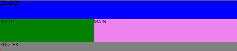
The container we have implemented provide us effectively with three screen sizes to take care of. In the next step we can have separate layout for each of them, for example:


w3schools have a page about Responsive Web Design . See following slide for highlights.
Responsive Design : Bootstrap
- Split screen into 12 columns.
- User can define how many columns are occupied by an element.
- Grids can be nested to create complex layouts.
- Element to column(s) mapping can be defined for given screen width(s).
-
Grid system with Flex.
A Complete Guide to Flexbox
Implementing all 12 columns for all screen sizes is too labour intensive for us. A solution would be to employ CSS preprocessor but you are not allowed to do so ...
Exercise: Grid system
Download this HTML document and fix TODOs in the source code. In order to test try resizing the window.
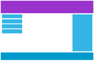
The results should look like this on screen:

Once done add the .container class to the div element with .row class. Try to resize window again.
Grid
There is A Complete Guide to Grid . Just remember you do not have time to read it. Should you use it during seminar just search for the information you need.
Grid is now pretty common, yet there is a way to check in CSS whether a broswer @support something.
Exercise: Grid
Download this HTML document and fix TODOs in the source code.
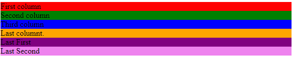
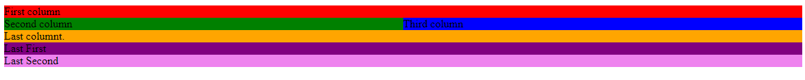
The results should look like this on screen:
- [0, 767>
-
<768, inf>
Menu
Responsive design is not only about layout. We may need to change the look and structure of selected components.
Exercise: Responsive menu
Download this HTML document and fix TODOs in the source code. You do not need JavaScript!
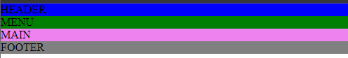
The results should look like this on screen (links to pictures):
The first item is selected i.e. has active :hover pseudo-class.
You may find it useful ...
Using CSS you can change mouse cursor.
It is common to employ a library of icons to improve visual of you application.
Light / Dark Mode
Why?
Developers use dark themes because bugs are attracted to the light.
Use of dark / light theme should be optional!
Exercise: Light / Dark mode
Download this HTML document and fix TODOs in the source code.
How are we doing?
- Motivation
- Container
- Columns
- Layout
- Menu
- Dark Mode